So, you’ve decided to take your business to the next level with a marketing mindset, but you’ve been bombarded by what seems like a veritable clown car of options. Take a deep breath, and let’s focus on step one: the logo.
A high-quality logo is one that makes a statement and accurately represents your brand, conveying a story in the blink of an eye. It can and will affect consumers on an emotional level which, in turn, affects how they feel about your products/services. Before you begin designing a logo, you must first understand that all elements of your brand are interconnected. Think about your company values, mission, and target audience. Make a list or a cloud and an idea should begin to form.
Now, you can think about shape & color.
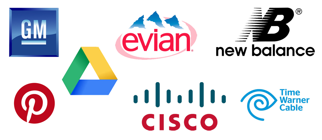
The shape of your design can project many different messages, and a recognizable shape can be a powerful tool in creating a logo people remember. Even the most basic shapes are significantly charged. Below is a list of common design elements and the energy/concepts/attributes they promote.
- Circles/Ovals/Ellipses: femininity, protection, perfection, infinite, complete, graceful
- Squares/Rectangles: professionalism, stability, security, honesty, reliability, order
- Triangles: movement/direction, masculinity, power, energy, balance, strength
- Vertical Lines: dominance, courage, aggression
- Horizontal Lines: peace, calm, flow
- Spirals: creativity, growth, openness
Equally powerful in the logo creation process, is the selection of your brand color palette. For example, did you know that the color red has been shown to increase the heart rate, evoking strong emotion? Likewise, shades of yellow can stimulate the nervous system, increasing a sense of clarity, and shades of blue represent peace and calm, evoking trust in your brand.
All in less than ninety seconds.
There is an endless number of color combinations and it is best to have a solid understanding of the tone you’d like to convey prior to making your selections. Refer to your list of company values and then research the psychology of color.
 Finally, if you will be integrating some sort of typography into your design (i.e. your business name or slogan), you will need to apply the same general concepts of shape psychology to the font you ultimately decide to use and be sure the entire design translates well in both print and digital formats.
Pay attention to trends (especially among your competitors), so that you know what works and what doesn’t, and remember – every logo evolves! Revisit your design every so often to make sure it’s still telling the right story.


