What Exactly Is a Branding Style Guide?
A company’s branding is defined by a set of guidelines called a “style guide.” This guides how the company positions itself to the outside world. Consistency in posting or using branded photos is made possible with the help of branding and style guides. It ensures that all of a company’s communications have the same tone and look, regardless of who created them.
Why You Need A Branding Style Guide Even If Your Business Is Small.
A branding style guide is essential for any business, regardless of size. You’ll want a style guide for a few reasons: The lack of cohesion is unprofessional, and it’s not enjoyable to explain your branding methods more than once. Consistency, on the other hand, makes things more easily recognizable and helps them to stay that way.
The Basics Of A Branding Style Guide.

Maintain a maximum of five pages for your style guide. People will lose interest or find it too difficult to absorb if it goes on much longer. It’s ideal if things could be kept brief and straightforward, just the main dos and don’ts.
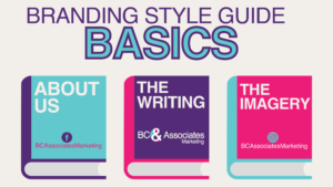
Part I: About Us
Create an “About Us” section to introduce yourself and your business. This should share your business story and the heart and soul of who you are.
Part II: The Writing
While it may seem inconsequential to some, your customers will take note of whether you use the written out or numerical version of numbers and whether you use ‘&’ or ‘and. The following are some additional considerations:
- Do you plan to employ emojis, or are you strictly prohibiting their use?
- In what kind of voice do you plan to speak? Words like “professional,” “casual,” “playful,” and “serious” are all good examples.
- What are some of the inappropriate expressions to avoid using?
Part III: The Imagery
A brand’s recognition can be boosted by using vibrant colors; customers are more likely to remember a company’s signature colors than any other identifying feature. For the visual components of your brand style guide, consider the following:
- Colors. This is probably the most crucial component. Color, as I’ve mentioned before, works wonders for brand awareness. If you want to avoid any potential confusion when creating visuals, providing the PMS (for printing purposes) and the hex code (for online use) for each hue is preferable.
- Logo. Can the logo be placed anywhere in the picture, or does it have to be in a specified area? Does the logo’s size matter regarding how it’s used? What kind of space should always be around the logo to let it breathe?
- Fonts. If you want your brand to be recognized, it’s in your best interest to maintain consistency in the typefaces used throughout your marketing materials. Avoid the usage of nonsensical fonts. If you’ve decided on a specific typeface, stick with it. Using a wide variety of fonts can give a disorganized impression.
Need Help Developing A Brand Style Guide For Your Small Business?
It would help if you made own branding and style guide now that you know what one is and why it’s crucial for organizations. Distribute it company-wide to ensure everyone is on the same page. This branding and style guide can save a lot of time in the future when deciding what font to use for a presentation or a graphic. You’ll be happy you read this blog and figured out how to make one for yourself. We make one for every customer so our team and partners can meet each brand’s needs. As a result, the client usually saves time and money.
Visit our other blogposts to gain more insights like Unlocking Success: The Power of Content Pillars for Small Businesses, or Mastering Small Business Marketing Strategies For Growth.


