The Power of Symbols in Branding
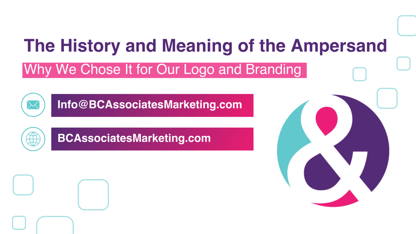
Every service-based business understands the challenge of standing out in a crowded market. Your logo is often the first impression potential customers have of your brand, and it carries the weight of conveying your values, mission, and uniqueness. The right symbol can encapsulate your entire brand identity in a single, elegant image. One such powerful symbol is the ampersand (&), which we have chosen to feature prominently in our logo and branding. But why the ampersand? To answer that, let’s delve into this intriguing symbol’s rich history and meaning and explore how it perfectly aligns with our brand ethos.
Why the History and Meaning of the Ampersand Matter to Your Business
Understanding the history and meaning of the ampersand isn’t just an exercise in curiosity. For service-based businesses, it’s a lesson in the power of thoughtful, intentional branding. The ampersand is more than a mere typographic character; it’s a representation of connection, collaboration, and creativity—all critical elements for any business that relies on strong client relationships. By incorporating the ampersand into our logo, we are honoring its historical significance and making a statement about our commitment to these values.
The Origins of the Ampersand: A Journey Through Time
The Birth of the Ampersand
The ampersand dates back to the first century A.D., originating from the Latin word “et,” meaning “and.” Scribes often wrote this simple conjunction in cursive script, gradually evolving into the more intricate symbol we recognize today. Combining the letters “e” and “t” formed a ligature; a single character representing two letters eventually became the ampersand.
Evolution Through the Ages
Throughout the centuries, the ampersand has seen various stylistic transformations. It was commonly used in manuscripts during the medieval period, and by the Renaissance, it had become a staple in printed books. The ampersand’s elegant curves and fluid lines made it a favorite among typographers and designers, who appreciated its aesthetic appeal and versatility.
The Ampersand in Modern Typography
In contemporary typography, the ampersand continues to be a beloved character. Designers experiment with its form, creating unique interpretations that reflect different styles and brand identities. The ampersand’s adaptability makes it a timeless symbol, capable of conveying both tradition and innovation.
Why We Chose the Ampersand for Our Logo
Symbolizing Connection and Collaboration
At the core of our business is the belief that strong connections and collaborations drive success. The ampersand perfectly embodies this ethos, symbolizing the partnership between us and our clients. It represents the synergy that occurs when we work together to achieve common goals.
Reflecting Our Creative Spirit
The ampersand is also a testament to creativity and design excellence. Its historical evolution showcases how something simple can be transformed into a work of art. By incorporating the ampersand into our branding, we signal our dedication to creativity, innovation, and the art of design.
Versatility and Timelessness
The ampersand’s versatility mirrors our ability to adapt to each client’s unique needs. Just as the ampersand can be styled in countless ways, we tailor our services to fit the specific requirements and visions of those we work with. Its timelessness assures our clients that while trends may come and go, our commitment to quality and excellence remains steadfast.
Common Mistakes and Myths About the Ampersand
Mistake: Overusing the Ampersand
One common mistake businesses make is overusing the ampersand, thinking it adds a touch of sophistication to their communications. However, like all design elements, it should be used judiciously to maintain its impact and avoid clutter.
Myth: The Ampersand is Just a Fancy ‘And’
Another myth is that the ampersand is merely a fancier way of writing “and.” In reality, it carries a rich historical significance and offers a unique aesthetic that can elevate a brand’s visual identity.
Best Practices for Using the Ampersand in Branding
Balance and Harmony
When incorporating the ampersand into your branding, ensure it complements other design elements. It should enhance the overall aesthetic without overshadowing other components of your logo or message.
Consistency is Key
Maintain consistency in how you use the ampersand across all your branding materials. This helps build a cohesive brand image and ensures that the symbol becomes a recognizable part of your identity.
Experiment with Styles
While consistency is important, don’t be afraid to experiment with different ampersand styles to find one that best represents your brand’s personality. Whether it’s bold and modern or elegant and classic, the right ampersand can speak volumes about your business.
Trends in Logo Design: The Return of Classic Symbols
Nostalgia in Modern Design
There’s a growing trend towards incorporating classic symbols like the ampersand in modern logo design. This blend of old and new creates a sense of nostalgia while also appealing to contemporary aesthetics.
Minimalism and Simplicity
Minimalistic designs are becoming increasingly popular, with businesses opting for simple yet powerful symbols. The ampersand fits perfectly within this trend, offering a clean and elegant design element that conveys depth and meaning.
Custom Typography
Many brands commission custom typography to create unique ampersands that reflect their identity. This trend allows for greater creativity and ensures that the ampersand used is one-of-a-kind, just like the business it represents.
Choosing the ampersand for our logo was a deliberate decision rooted in its rich history and profound meaning. It symbolizes the connections we build with our clients, our commitment to creativity, and our adaptability to their unique needs. By understanding the significance of the ampersand, you can appreciate the thoughtfulness behind our branding and consider how such a powerful symbol can enhance your own brand identity. Ignoring the potential of thoughtful branding elements like the ampersand could mean missing out on creating a deeper connection with your audience. Embrace the history and meaning of the ampersand, and let it inspire your own branding journey. For more insights into effective branding strategies, check out our blog on Branding and Digital Marketing for Service-Based Businesses.
P.S. Ready to spark your unique opportunities and ignite your marketing? Here are three ways to work with us.
1. 📞 Schedule a Complimentary 15-minute Call and let’s delve into your goals and answer any questions you may have.
2. 📘 Read Beverly’s book Marketing for Entrepreneurs a quick guide filled with actionable steps to help make your brand and business shine even brighter. 🎙️ Listen to Beverly’s Marketing Podcast where she interviews entrepreneurs to get inspired and gain new business and marketing insights.
3. 🎓 Learn more about marketing and Enroll in Our Marketing Courses designed to bring clarity to your business efforts. They’re easy-to-understand and self-paced, perfect for busy entrepreneurs like you.